It's rare to see a hand lettered menu these days. Business owners have a ton of options when it comes to pre-fabricated menu boards, many of which do not require the expertise of a sign industry professional. The changing nature of food service also discourages those potential clients from committing to a menu that is a) difficult to change, and b) lets face it, more expensive. Still, some clients have tried the other options and are now ready to invest in the benefits of a hand lettered menu.
I remember the first hand painted menu that grabbed my attention; it was at Cassell's Hamburgers, located in the ground floor of the Hotel Normandie in Los Angeles. I believe it was painted by Colt Bowden although I don't have a source to verify this. I ordered a hamburger (this was before I began my studies to become a sign painter at LATTC) and sat at the counter, admiring the decor of the establishment which made me feel like I was in an old movie. Gazing around, my eyes kept coming back to the red blue and black lettering on the menu behind the counter. I was noticing the material it was made from - the gloss of the letters and slight anomalies in character structure told me it had been lettered by hand. I admired the tactile quality of the paint and marveled at the neat arrangement of the information that allowed my eye to move through it effortlessly. They also had a printed version of the menu folded at each place setting so I took one with me to study. I couldn't fully believe that the whole thing had been painted and designed by hand. The burger was excellent too by the way.
I began thinking about menus more and noticing which ones were hand painted. Some of my favorite spots had them! I'd simply never noticed before. I liked going there because they were consistent, both the quality and the fact that they always had the specific dish I liked to order. I associated them with comfort, not only because of the food, I realized, but because the menu itself was always there, its character greeted me like an old friend. Recently I visited two of those places and was dismayed to find they had gotten rid of the old hand painted menu boards and replaced them with sterile digitally printed menus. Somehow the food tasted a little different to me as well...
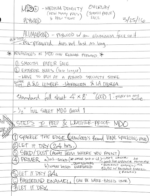
Laying out and painting a menu is a lot of work. Luckily the final assignment in the first semester of Sign Graphics at LA Trade Tech was to lay out and paint a menu, without using a computer. There is a journeyman trick for spacing the items, which I have included from my school notes. Normally we paint signs that have light (1 word) to heavy copy (5 + words). Menus, even simple ones, have over a dozen words and numerals, and many have hundreds. It is important to format the information in a way that is easy to read, because the business and the customer both depend on the menu to sell the product. It must be accurate and attractive to the eye. It must be invisible, yet also prominent. What I mean is that we expect to see the options and prices integrated with the surroundings. A menu must carry the character of the establishment without being attention-seeking; its purpose is solely to inform.
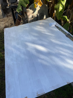
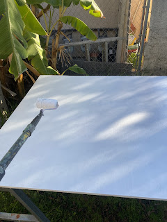
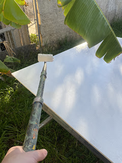
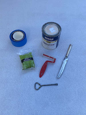
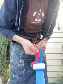
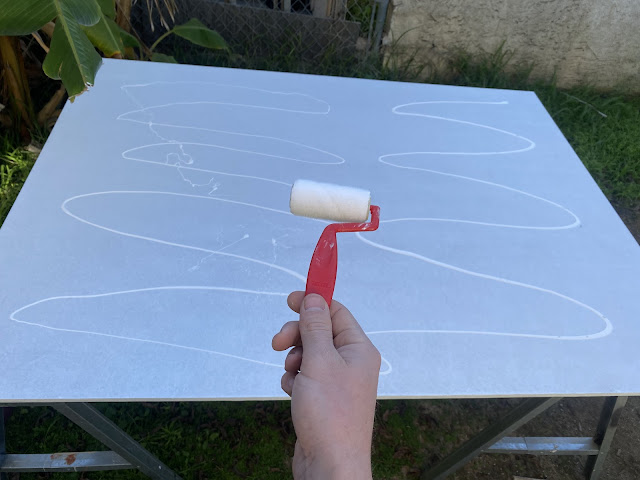
Here are some menus I've done, with varying levels of proficiency. For panels, tape them off with masking tape then sand the interior edge with fine grit sand paper. Then you can use a 3-inch cotton roller to fill in the panel background.


